problem statement
Finding unique coffee spots beyond popular chains can be a challenge, especially in unfamiliar locations. Traditional methods like Instagram searches and Google reviews are time-consuming and lack a dedicated community space.
context
This project was part of my CareerFoundry bootcamp, where I was challenged to design a mobile app for iOS and Android.
The goal was to create a user-centered solution to a specific problem, drawing on my knowledge of mobile design patterns and interaction principles.
mt role
I led the end-to-end design process for Bean Map, working as a UX/UI designer to create an intuitive mobile app that enables coffee enthusiasts to discover specialty coffee shops and connect with a community of fellow coffee lovers using geolocation.
The project involved wireframing, designing, and prototyping an app that addresses user needs while ensuring a seamless experience across both platforms.
Research Phase: Defining User Needs and Market Gaps
user research
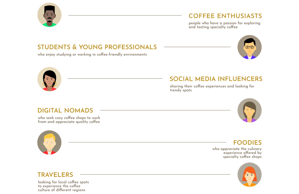
Focused on Five User Groups with Distinct Coffee Needs
Bean Map is designed for five key user groups:
Competitive Analysis
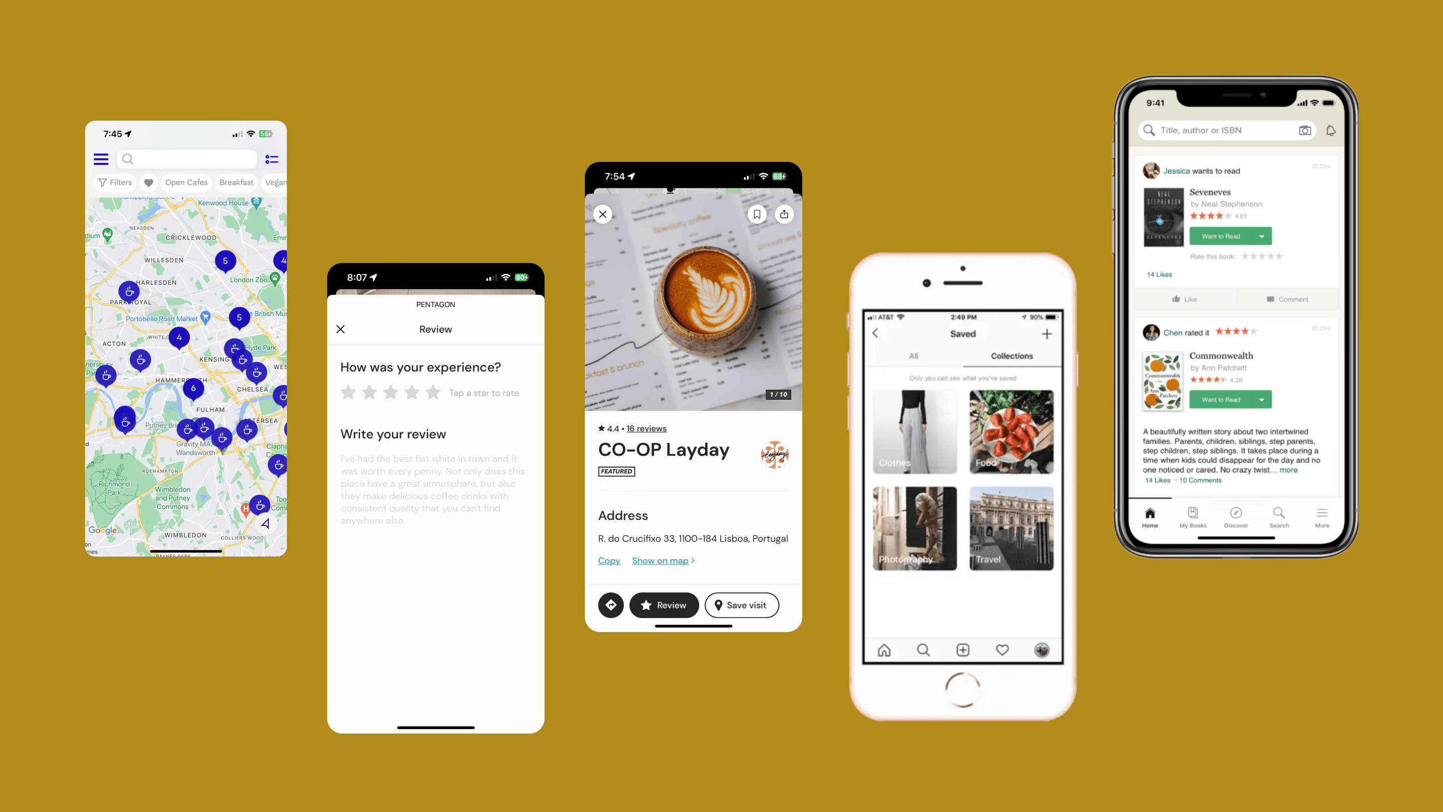
Learned from Existing Apps to Shape Bean Map’s Key Features
Conducting a competitive analysis of relevant apps revealed insights that guided key features for Bean Map:
Map-based navigation for seamless location discovery (Coffee Trip, Roasters)
Search and filter options to simplify finding specific coffee spots (Google Maps, Coffee Trip)
Centralized social feed to encourage engagement among coffee enthusiasts (Instagram, Goodreads)
user flow
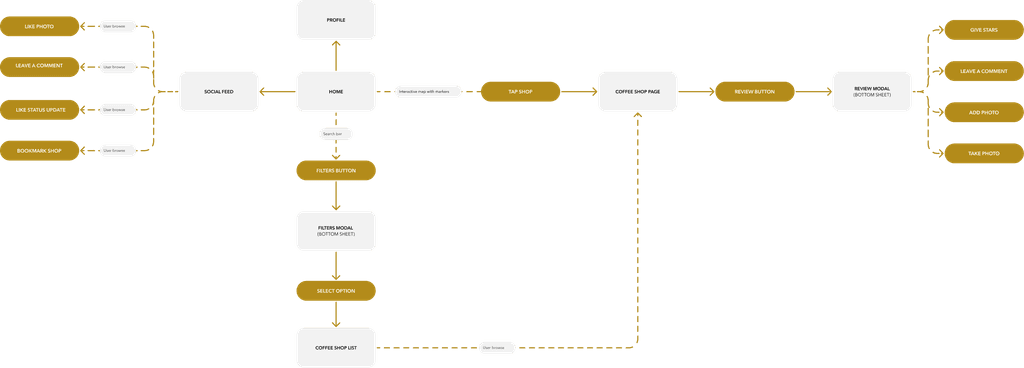
Mapped an Intuitive User Flow
The competitive analysis led to a user flow focused on accessible, engaging discovery and interactions:
Wireframing
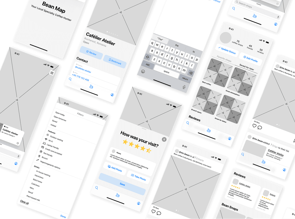
Built User-Friendly Wireframes Following Design Guidelines
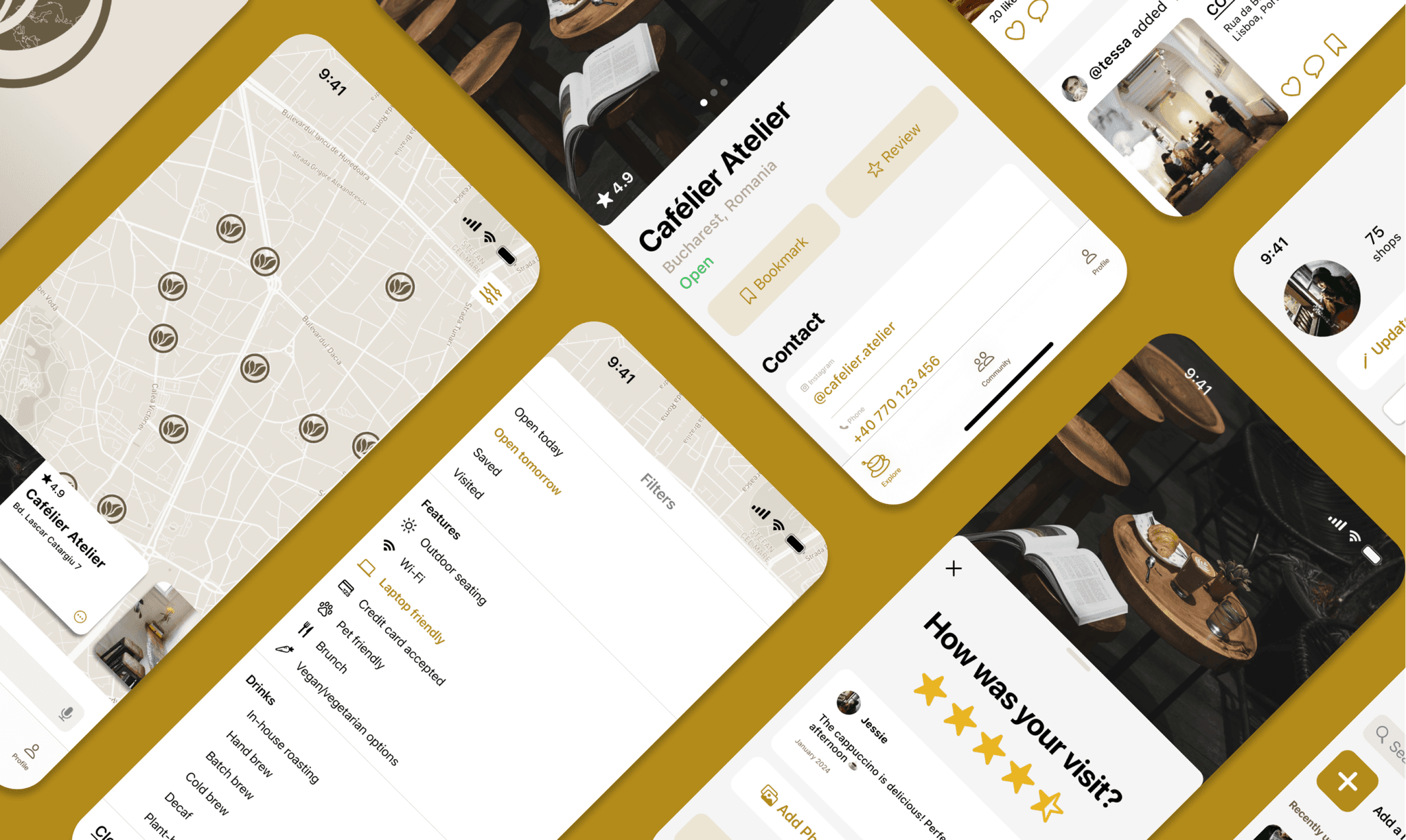
Using insights from the competitive analysis, I developed mid-fidelity wireframes and prototypes in accordance with Apple’s Human Interface and Material Design guidelines, ensuring a smooth experience across platforms. (iOS displayed below)
Solution: Delivering a User-Centered, Community-Driven Coffee Experience
User Testing Helped Me Refine Navigation and Design Patterns
I recruited several users that were most familiar with iOS and Android, respectively, to test, wanting to generate feedback on the following questions:
Is the flow for finding coffee shops accessible & intuitive?
Do the patterns for the feed & discover align with current design trends?
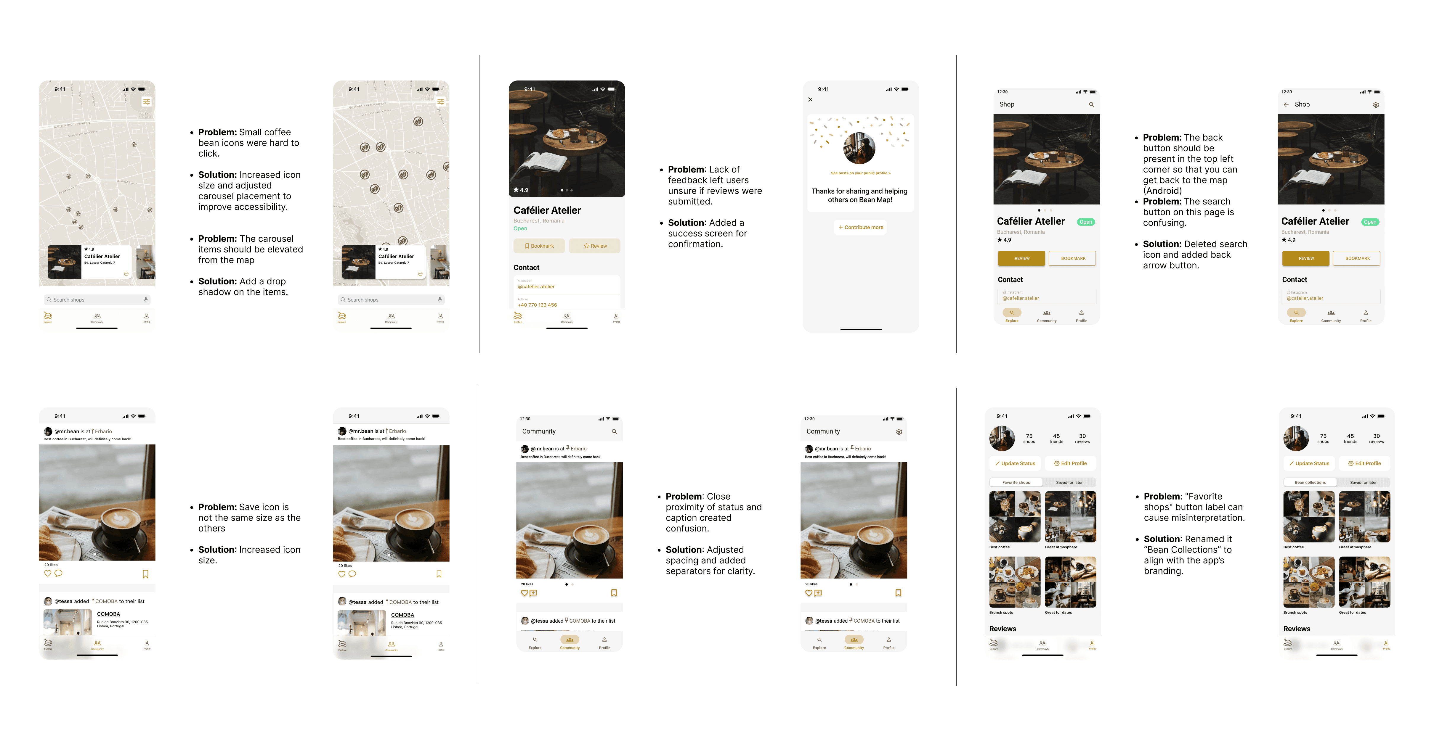
Incorporating User Feedback to Solve Usability Issues
Feedback from the five participants highlighted several strengths in Bean Map’s design:
Fresh, simple, clean design
Intuitive layout and navigation
Effective use of pop-ups and dialogs
Appealing color palette
Good integration of Material Design components
Testing the prototypes also revealed valuable insights that informed the next iteration:
Impact & Future Plans
Initial Feedback Encourages Growth Projections
Future Iterations
Exploring a Premium Model for Enhanced User and Business Benefits

