problem statement
For plant enthusiasts, online shopping for plants is often a cumbersome experience. Traditional e-commerce interfaces, cluttered navigation, and limited filtering options can lead to user frustration and high drop-off rates.
context
This project was part of my CareerFoundry bootcamp, where I was challenged to design a responsive shopping app that made online purchasing effortless.
The goal was to create a user-centered solution for shoppers who prefer browsing and buying items online, using intuitive navigation, clean layouts, and streamlined filtering to enhance the online shopping experience.
mt role
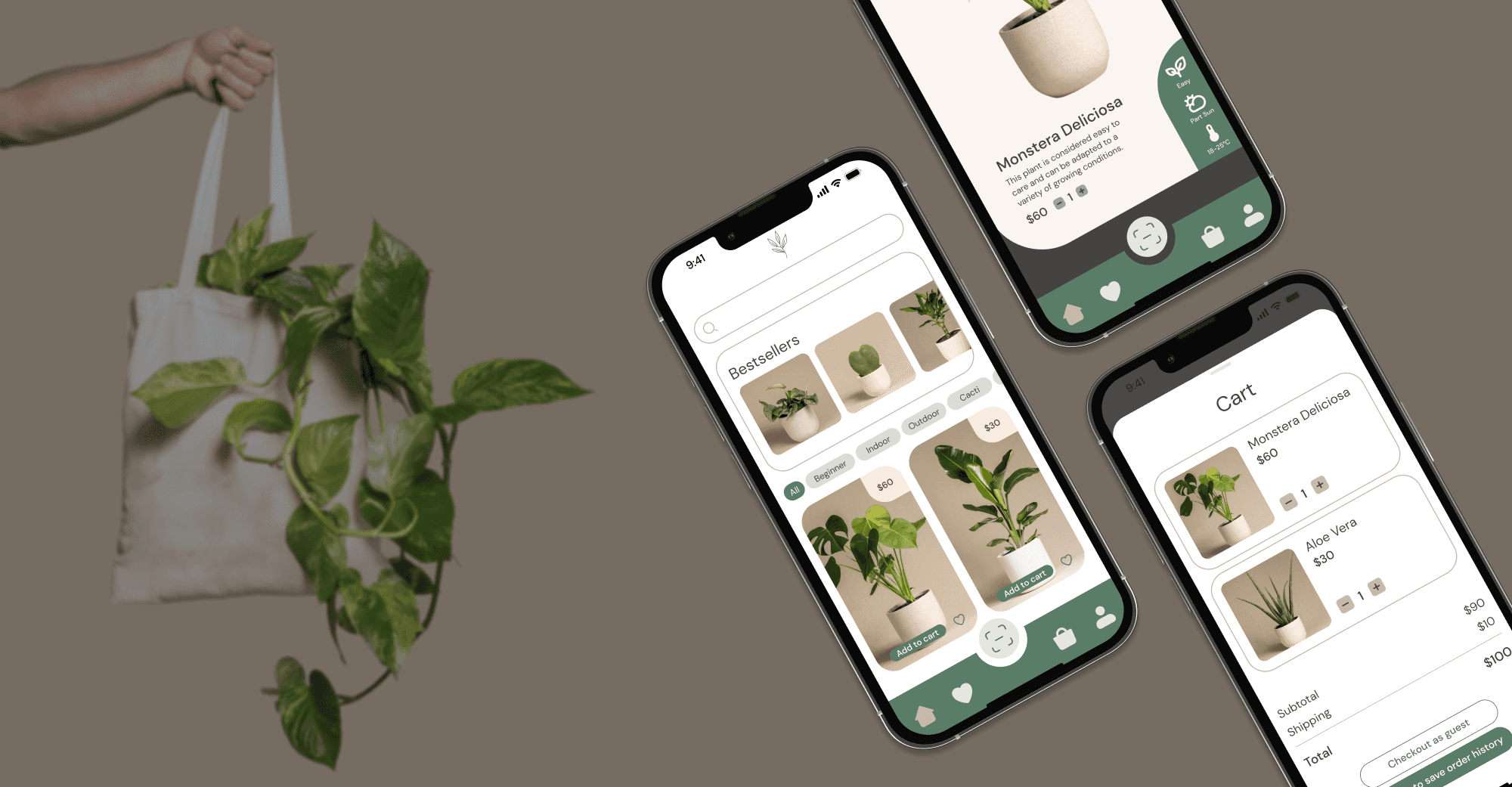
I worked as a product designer to create a user-friendly app that simplifies plant discovery and purchasing, offering an intuitive flow for plant enthusiasts on both mobile and desktop.
With a clean, user-centered interface, botanico is built for ease, allowing both seasoned and new plant lovers to discover and buy plants effortlessly.
Research Phase: Uncovering User Needs to Guide Design Decisions
Identified Key User Stories
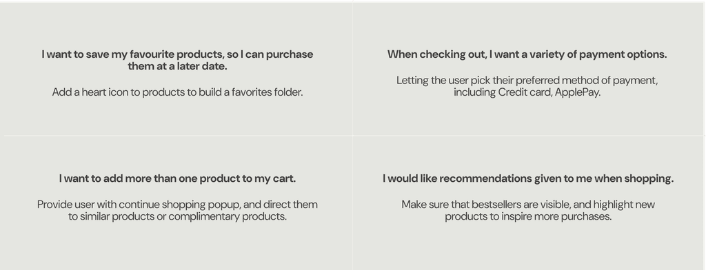
To ensure botanico addressed real user needs, I developed several key user stories to define the app’s core functionality:
user flow
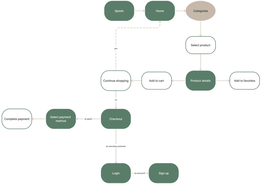
Mapped a User Flow for an Intuitive Experience
I crafted a streamlined user flow diagram to define the journey from plant discovery to purchase, ensuring easy, accessible navigation at every step.
Conducted a Competitive Analysis to Guide Design
Analyzing existing online plant stores and general e-commerce platforms, I identified key features that could improve the plant-shopping experience—all critical elements for botanico's design:
Streamlined navigation
Robust filtering options
Simplified checkout process
Design Process: Developing a User-Centric Shopping Experience
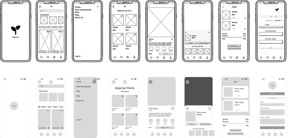
Developed Wireframes from Low to Mid-Fidelity
Using insights from the research phase, I designed low- and mid-fidelity wireframes to ensure every page offered clear paths forward. The wireframes aligned with user expectations for friendly navigation and efficient interactions.
user testing
Tested Prototypes and Gathered User Feedback to Refine the Design
second iteration
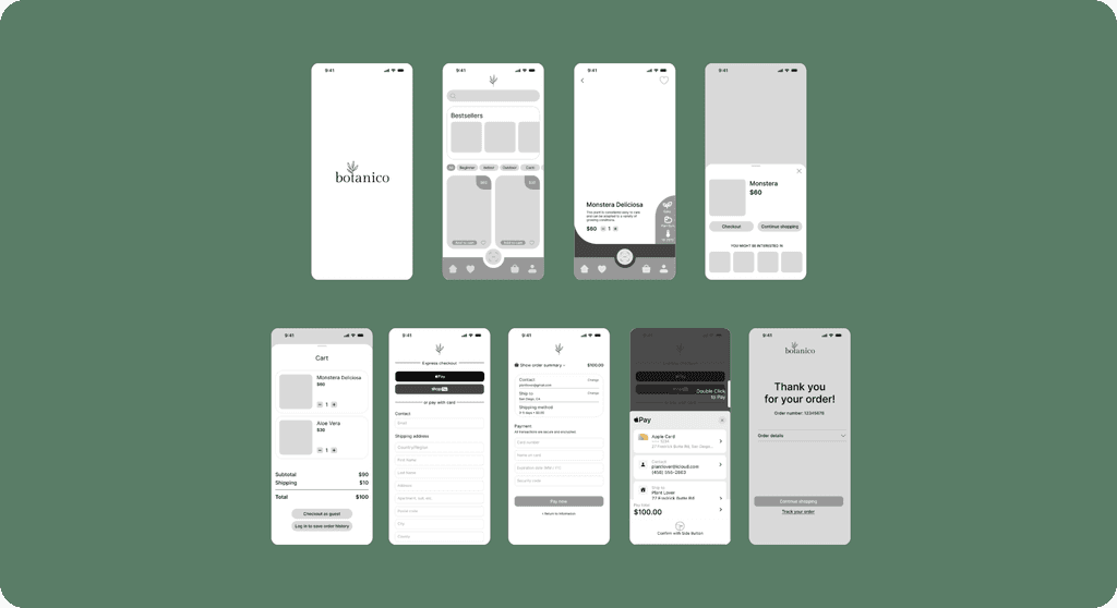
Iterated Based on Feedback to Perfect the User Experience
Enhanced filtering options and made them more visually accessible.
Updated the beginner filter to refresh within the view.
Improved navigation consistency to align with standard app patterns.
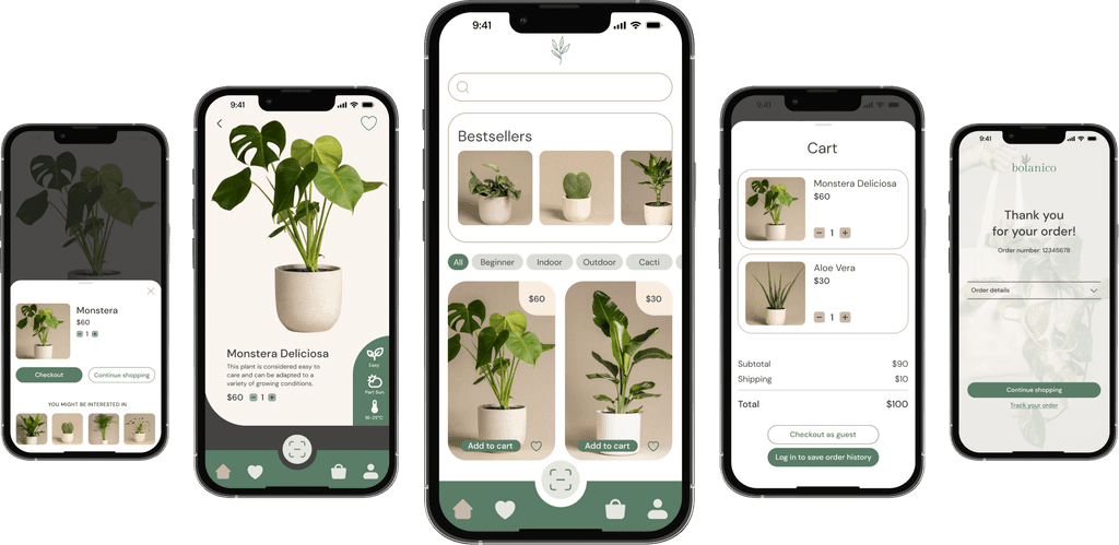
Added a confirmation screen post-checkout to clarify successful transactions.
Solution: An Intuitive, Friendly App for Effortless Plant Shopping
botanico's clean, engaging interface prioritizes easy plant discovery, intuitive filtering, and a fast checkout experience, enabling users to explore and purchase plants with confidence and convenience. An iterative design process, guided by user feedback, ensured the product is both functional and enjoyable to use.
Visual Identity: Creating a Trustworthy, Clean Brand
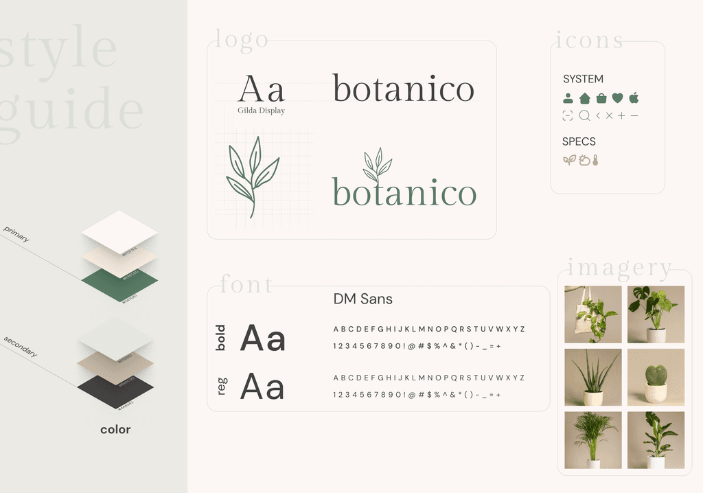
Crafted a Modern, Nature-Inspired Logo
Defined Consistent Imagery
To create a professional look, I used product images with clean, neutral backgrounds and studio lighting. This consistency enhances trust and provides a polished, cohesive aesthetic throughout the app.
Responsive design
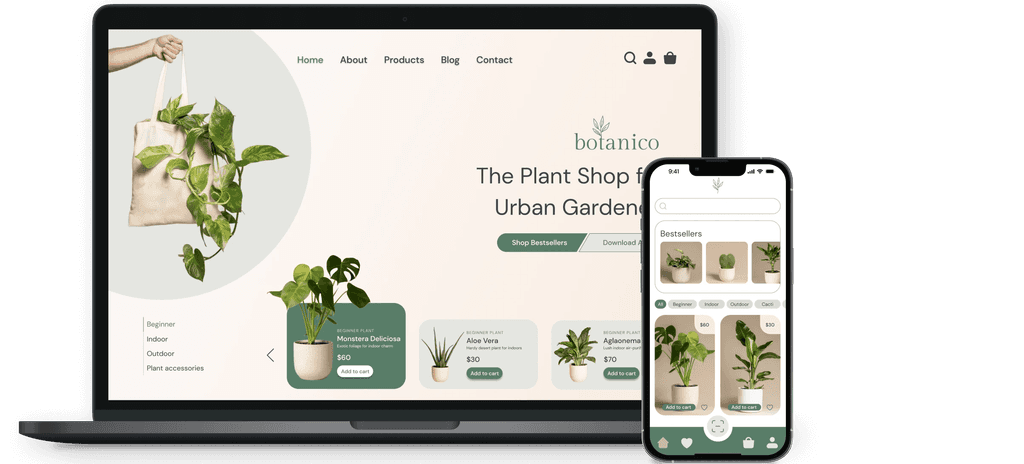
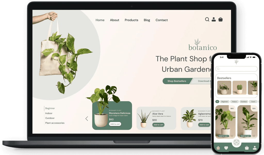
Expanded to Desktop for Accessibility
Measuring Success: Tracked Key Metrics to Drive Growth and Satisfaction
Projected Impact and Success Metrics
To envision botanico's potential impact and maintain a user-centered approach, I defined several key success metrics to guide future development and measure anticipated outcomes:
User Engagement: Tracking the number of active users and time spent on the app.
Sales Metrics: Monitoring the number of transactions and average order value.
User Feedback: Collecting and analyzing user reviews and ratings to continuously improve the app.
Growth Metrics: Evaluating the growth in the user base and market reach over time.
Focusing on these KPIs would allow botanico to evolve based on user feedback and maintain its edge in a competitive market as it develops.
