problem statement
Many women experience hormonal health challenges, such as PCOS, endometriosis, and infertility, which negatively affect their daily lives. Current tools lack an accessible approach to support hormonal health through diet, an area that could significantly reduce these symptoms.
context
This project began as part of my CareerFoundry bootcamp, where I was tasked with designing a responsive recipe app from scratch.
The brief challenged me to identify key user pain points with existing recipe apps, complete both UX and UI phases, and create an accessible, mobile-first web app.
mY role
I worked as a product designer, identifying a market niche for hormone-supportive recipes through UX research.
I led the concept and design of a responsive app aimed at helping users easily discover cycle-optimized recipes that support women’s hormonal health through phase-specific, personalized nutrition.
Research Phase: Uncovering User Needs to Drive Meaningful Design Choices
Main hypothesis
Women aged 20-40 are increasingly exploring cyclical eating aligned with menstrual phases. CycleChef’s target user likely:
user interviews
Interviewed Users to Uncover Their Needs
I conducted interviews with four potential users with targeted questions to provide qualitative information about their preferences. Common pain points included:
Recipes that include photos of the finished meal
Streamlined access to recipes without excessive scrolling or additional content
Nutritional information provided alongside recipes
Display cooking time and ingredients prominently
Inputting symptoms to receive tailored food remedies
Extracted Key Insights to Drive Design
User interviews revealed key insights, including preferences for:
Recipes with clear instructions, cooking time, and nutritional information
A symptom-tracking feature to suggest foods for specific symptoms
A distraction-free recipe experience with prominent images and concise content
User Personas & MVP Objective
Defined Audience & Set App Objectives
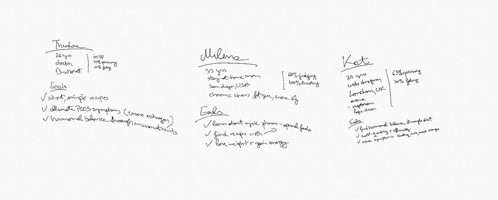
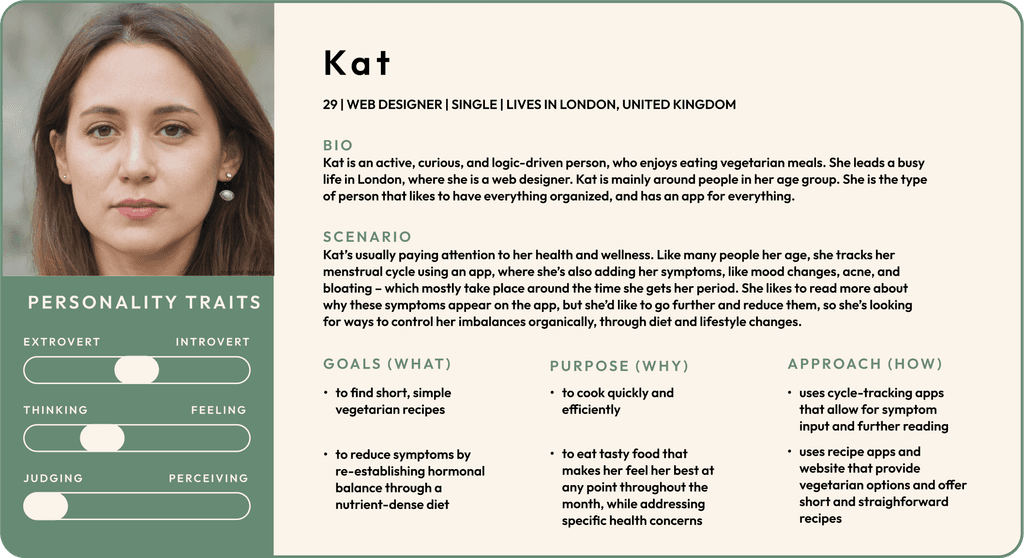
I created several user personas—I am highlighting one below. Paired with the insights from user research, I developed an MVP objective emphasizing:
A simple user interface with easy access to recipes and educational content
A clean design focused on hero images, with a straightforward layout for recipes
user flow
Mapped an Intuitive User Flow
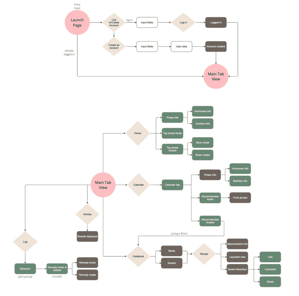
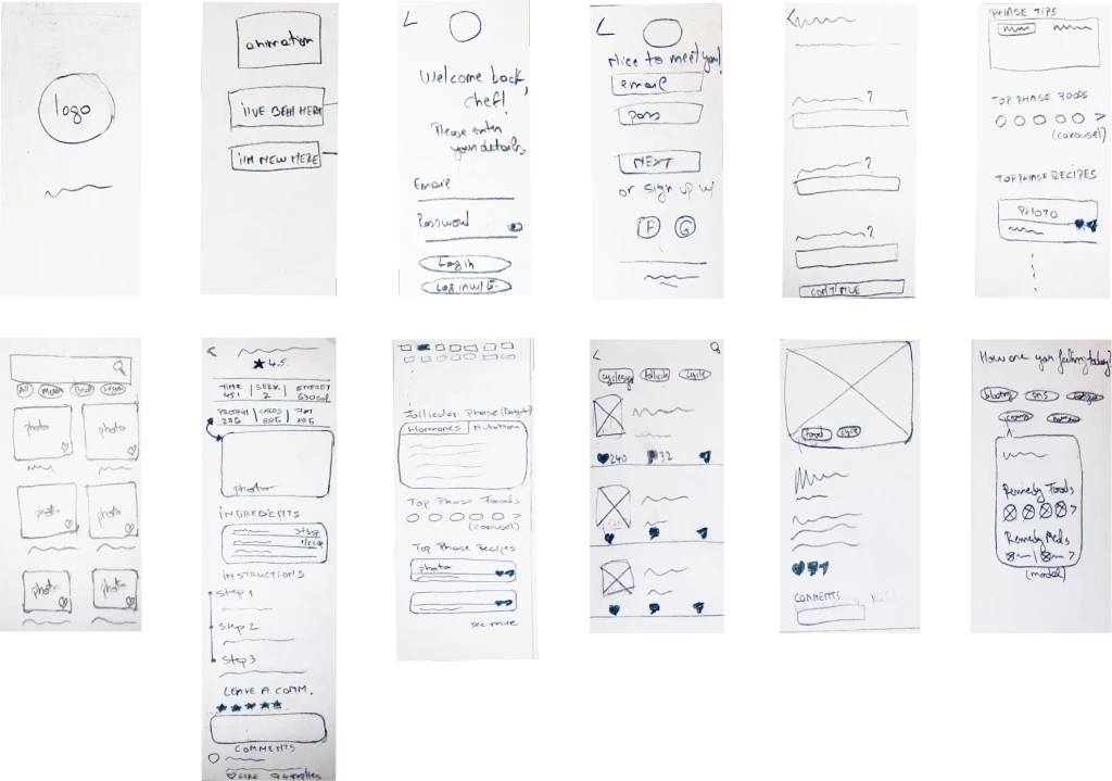
Building on this foundation, I mapped a user flow that clarified essential touchpoints, guiding the screen ideation process to ensure a user-centered, intuitive layout focused on seamless navigation and meaningful content discovery.
Rapid prototyping & user testing
Got the Users Involved Early On by Testing Rapid Prototypes
I decided to get users involved early on—I rapidly prototyped the app and conducted usability tests to gather feedback on core functions. This feedback highlighted:
Desire for faster access to recipes, with minimal distractions
Preference for labeling the symptom log feature more clearly
Interest in a streamlined home page with options to explore more recipes
reiteration
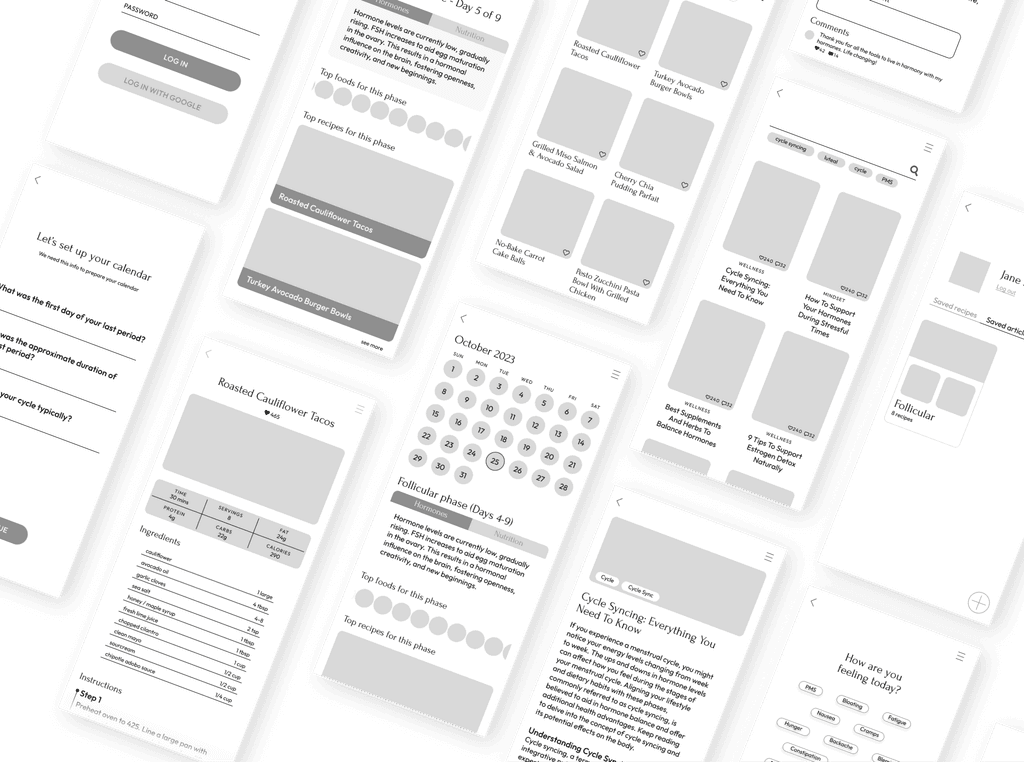
Refined the Design for a Better User Experience
Based on test findings, I:
Centered recipe pages around a large hero image with simple instructions
Renamed ambiguous features for clarity (e.g., “Log” to “Symptoms”)
Added a “See More” option on the home page to encourage recipe exploration
Solution: Crafting CycleChef to Empower Healthier Choices
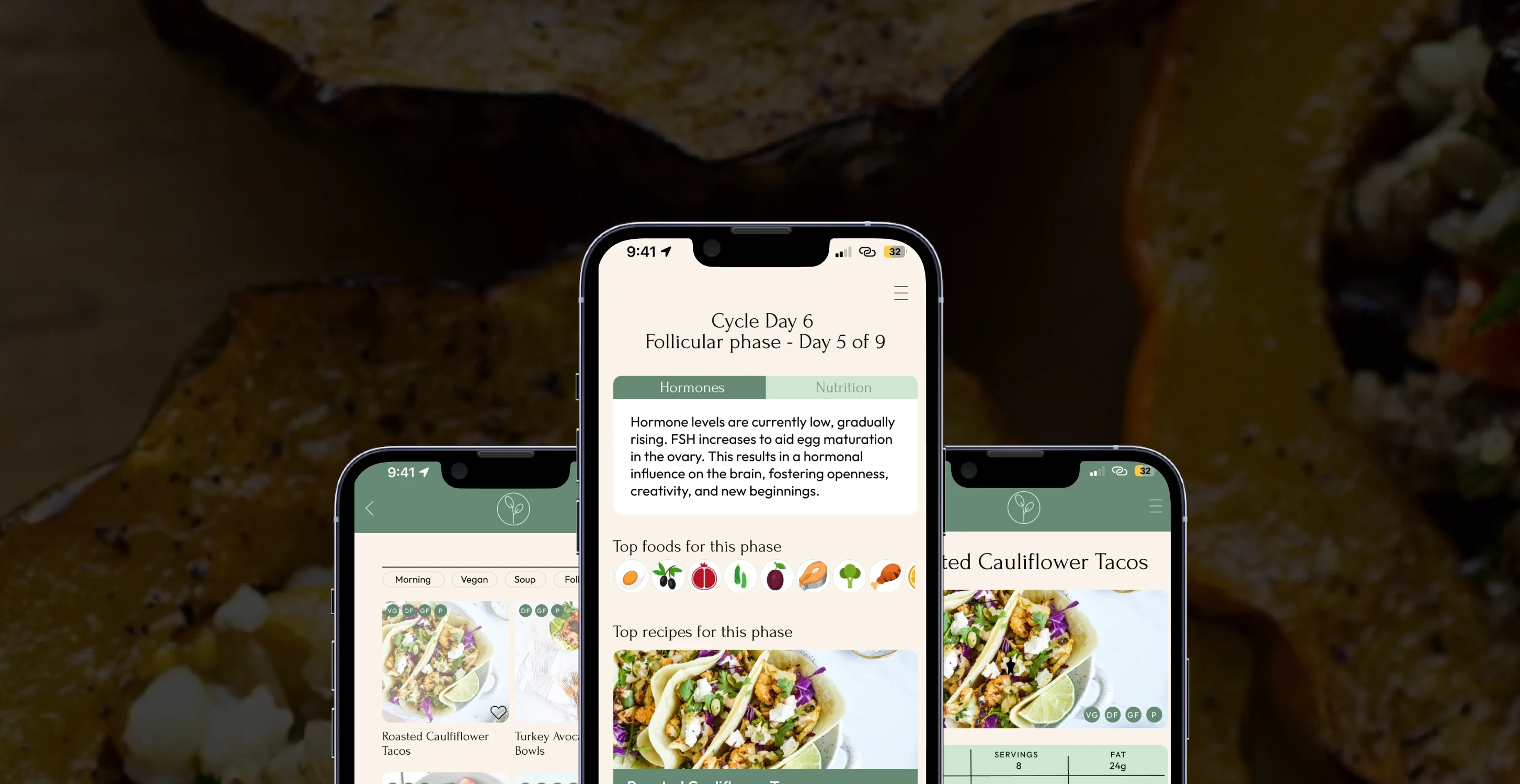
CycleChef provides a structured approach to hormone-balancing nutrition, offering:
Recipes specifically tailored to each menstrual cycle phase
Educational content on nutrient-dense, hormone-supporting foods
A cycle-tracking feature that aligns diet with menstrual phases for personalized recommendations
Visual Identity: Designing an App that Feels Supportive and Natural
Branding & Style Guide
Created a Brand That Resonates with Users
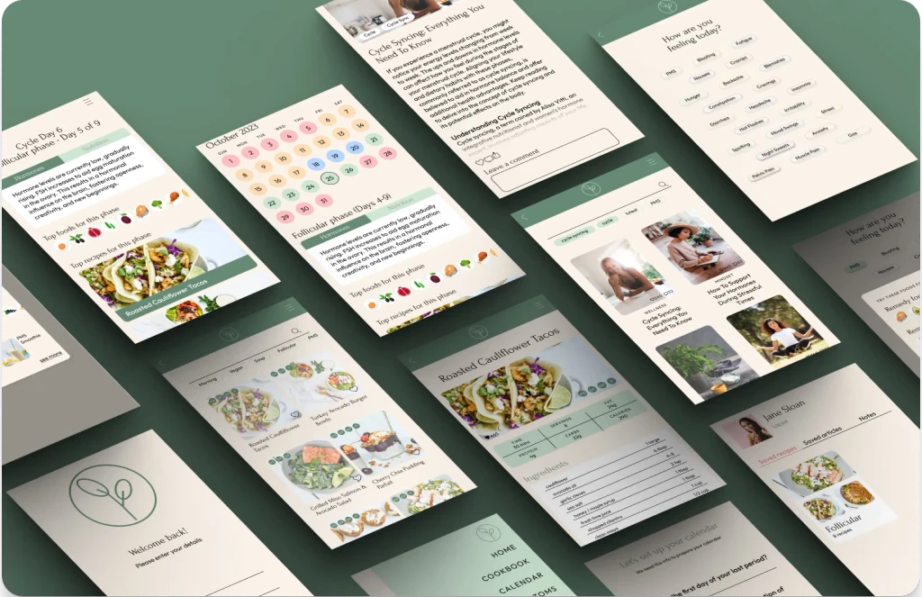
CycleChef’s branding embraces a clean, natural aesthetic that highlights its focus on wholesome nutrition and support. The visual identity centers on the food-health connection, featuring vibrant, fresh dishes and a pastel color palette. Soft greens evoke freshness, while pink subtly hints at the menstrual cycle. Simple icons and a chic font add a modern, aesthetic feel.
Responsive design
Ensured a Seamless Experience Across Devices
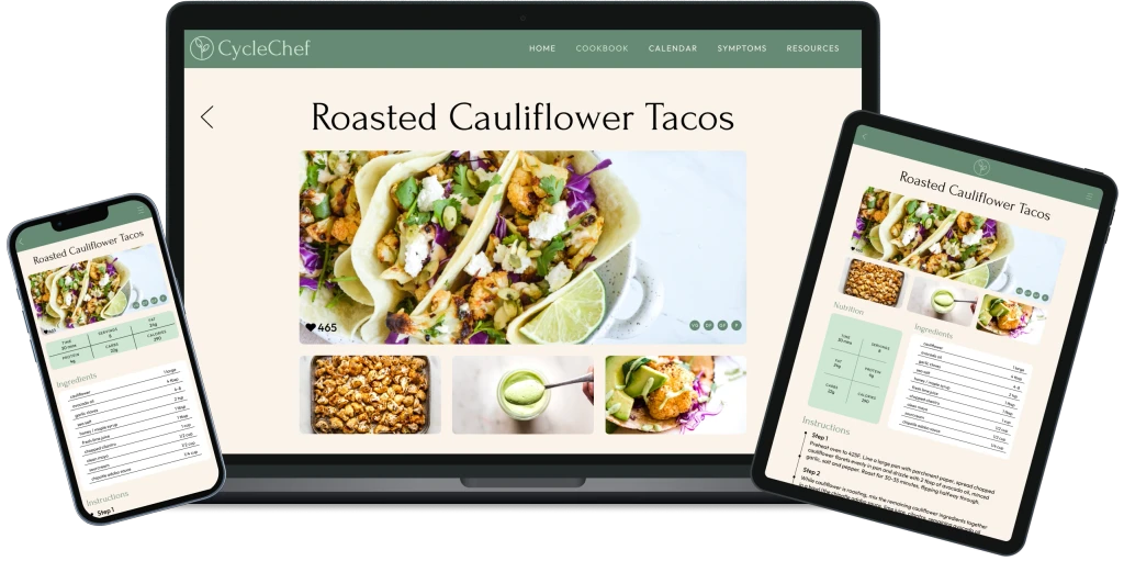
The interface adapts seamlessly to mobile, tablet and desktop formats, providing a distraction-free recipe page on all devices.
CycleChef Shows Strong Potential from Early Stages
Initial Feedback
Projected Future Impact
User adoption rates: aiming for a 5-10% monthly growth within the target demographic of women aged 20-40
Retention rate goals: targeting a 60% monthly retention through continuous engagement with educational and seasonal recipes
Future Iterations
Envisioning Next Steps for Growth
To continue evolving CycleChef, I plan to:
Implement machine learning to offer increasingly personalized meal recommendations
Integrate a community space for users to share experiences and recipe suggestions
Expand recipe filtering options to cater to dietary restrictions and ingredient availability
