project overview
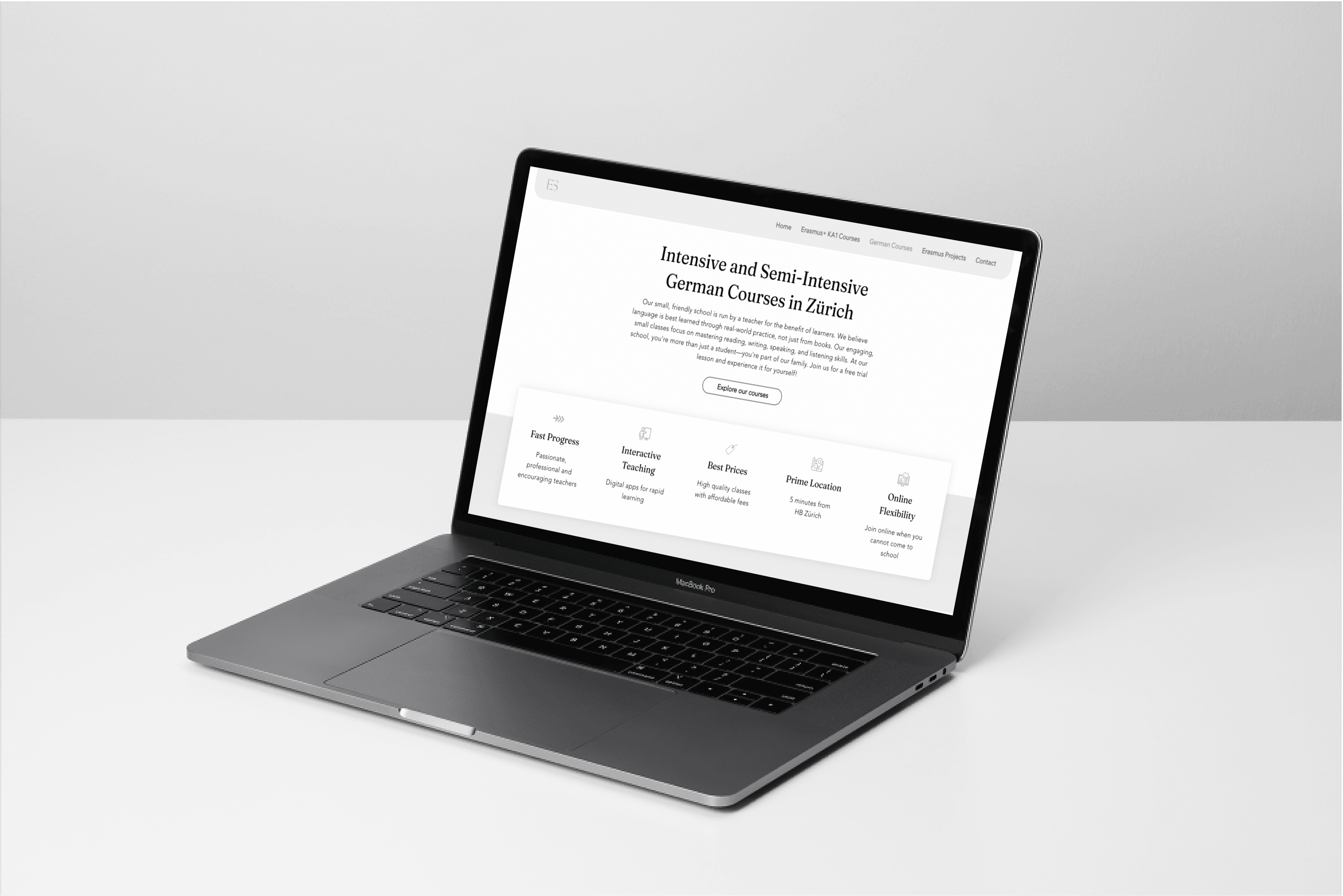
Eruditus School, an educational provider, required a complete website redesign to improve user engagement and better serve its growing mobile audience. The main objectives were to modernize the site’s layout, enhance content organization, and create a fully responsive experience across devices.
problem statement
The original Eruditus School website lacked a modern, user-friendly design, making it difficult to navigate and access key information, especially for mobile users.
About Eruditus school
Eruditus School offers Erasmus teacher training and German language courses for international learners.
mt role
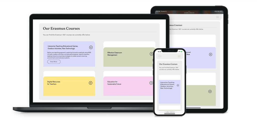
I led the end-to-end redesign process as a UX/UI designer, using Wix Studio to build a responsive site. My tasks included site layout, responsive typography, and the restructuring of content to be more user-friendly, visually appealing, and optimized for search engines.
Impact summary
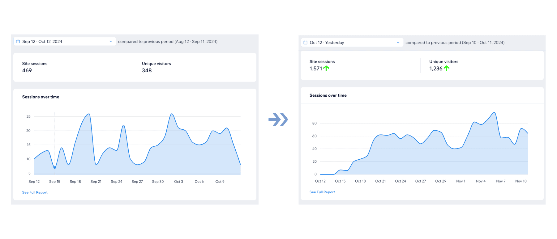
The redesigned Eruditus School website has already shown strong early success, with significant improvements in both user engagement and SEO metrics: +235% ↑ monthly sessions, +250% ↑ unique visitors, +225% ↑ organic search visits.
Research Phase: Analyzing User Needs and Market Trends
client kickoff
The redesign process began with a client kickoff meeting, where we discussed the project scope, objectives, and deliverables. During this phase, I gathered valuable information directly from the client, including their vision for the new website, user feedback, and specific features that needed to be incorporated in the redesign.
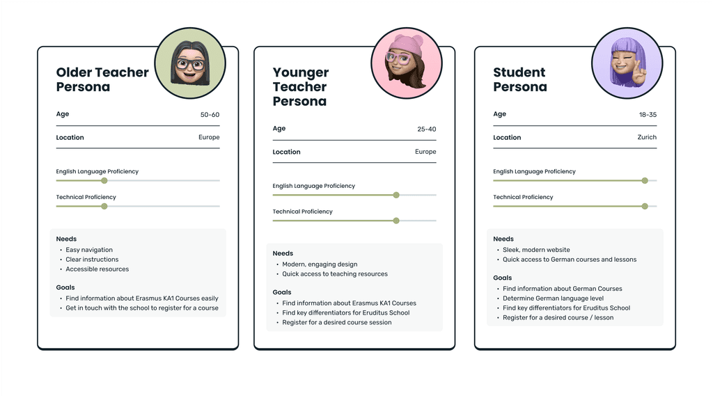
user personas
The client also provided insights into their diverse user base, which helped shape the direction of the project. Key user groups included:
Early insights
I identified key issues that formed the foundation for the redesign, helping me focus on making the site visually engaging, content-light, and responsive across platforms.
Overloaded Text
The original site was packed with dense text, overwhelming users and making key information difficult to digest quickly.
Poor Use of Color
Important elements and calls to action were hard to spot, as color was not strategically applied to emphasize these areas.
Outdated Design
The previous design felt outdated, making it less engaging for users and giving a less polished impression of the brand.
Limited Mobile Usability
With over 60% of traffic coming from mobile devices, the site’s desktop-oriented design was frustrating for mobile users and led to usability issues across devices.
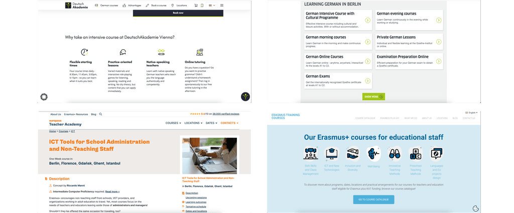
competitive analysis
Conducted Competitive Analysis to Gain Insights from Industry Leaders
Solution: Implementation of Full Redesign with Key Design Updates to Enhance User Experience
responsive design
Prioritized Mobile-First Approach for Seamless Multi-Device Access
Problem / Need
Responsive layouts optimized for readability and usability
Solution
I used layout tools like section grids and repeaters, enabling multi-column desktop layouts to become single-column structures on mobile.
Problem / Need
Responsive hierarchic typography
Solution
Fonts were sized and scaled appropriately for readability across devices.
Problem / Need
Easier navigation for a more intuitive mobile experience
Solution
The layout and content hierarchy were adjusted to reduce the number of clicks and scrolling required.
Erasmus Courses Page
German Course Page
Individual Course Page
Video Walkthrough
challenges
Overcoming Design and Platform Limitations
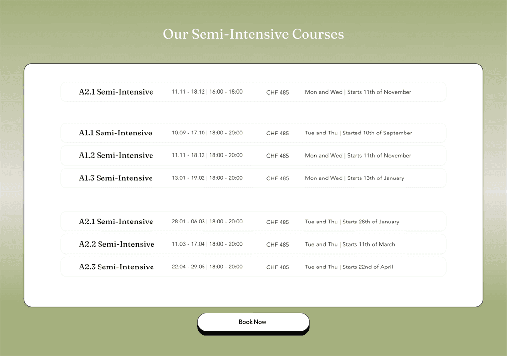
Working in Wix Studio presented some challenges, especially since the platform has fewer customization options than some other design tools. For example, the absence of user-friendly table options meant I had to find a workaround:
I created editable stacks that allowed the client to update content as needed without extensive technical knowledge or additional developer support.
Impact: +235% ↑ monthly sessions, +250% ↑ unique visitors, +225% ↑ organic search visits
The redesigned Eruditus School website has already shown strong early success, with significant improvements in both user engagement and SEO metrics:
Site Engagement
Monthly sessions have more than tripled, a 235% increase
Unique visitors increased by over 250%
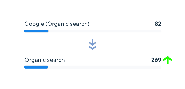
Organic search visits surged by 228%
User Behavior
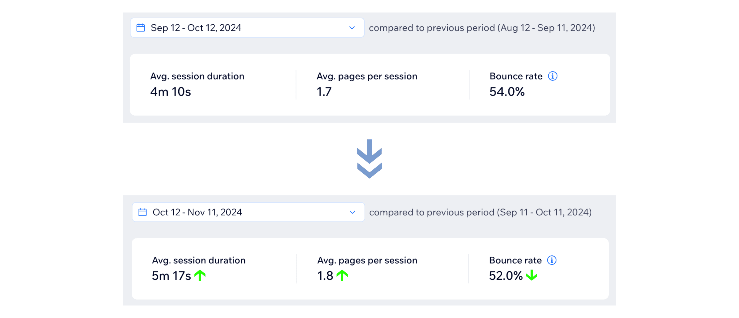
Average session duration increased from 4m10s to 5m18s.
Average pages per session rose from 1.7 to 1.8, indicating increased interest and engagement.
Bounce rate decreased from 54% to 52%, suggesting visitors are finding relevant content more effectively.
SEO Optimization & Organic Growth
Drawing on my digital marketing background, I set up Google Search Console and implemented on-page SEO optimizations like meta descriptions and titles, which contributed to a boost in organic search traffic (surged by 228%).
conclusion
Responsive Design Ensured Seamless User Experience Across All Devices
The redesign of the Eruditus School website led to improved user engagement, with longer sessions, better overall user experience, and enhanced website performance.
I am proud to say we successfully built a strong structure while keeping it simple for the client to manage.
client feedback
"Collaborating with Andra has been a truly exceptional choice for us. We had explored several other avenues before, but none delivered the outcomes we needed. Our goal was a modern, responsive and user-friendly website, and she has exceeded those expectations.
As someone whose offerings and details change frequently, I wanted a website that I could easily update without needing assistance—and Andra built a flexible structure that allows me to do just that. It’s not only functional but also beautifully designed and intuitive for users to navigate. She paid great attention to every detail—from the authentic photos to the responsive layout for mobile users.
The transformation of our school website is remarkable, and the increase in traffic speaks for itself!" — Felicia D.
